Just like we’re into Halloween-themed candy packaging, we’ve got a place in our packaging hearts for spooky and fun Halloween cereal packaging. There’s something about cereal brands (that we all ate while growing up) colliding with the Halloween season that creates packaging designs we adore. Here’s 5 examples of Halloween cereal packaging that we think are spook-tacularly memorable.
The Monster Cereals in Original Packaging
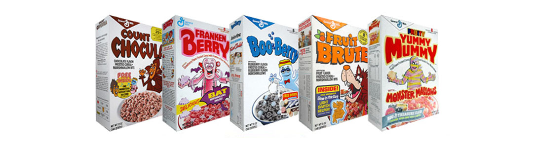
Way back in March 1971, General Mills released the chocolate-flavoured Count Chocula and the strawberry-flavoured Franken Berry. Thanks to their popularity, the blueberry-flavoured Boo Berry hit shelves in December 1973, followed by Fruit Brute in 1974. Fruity Yummy Mummy debuted in 1987, creating a line that would come to be known as the “monster cereals.” Fruit Brute and Fruity Yummy Mummy would be discontinued in the early ’80s and ’90s, but their effect was legendary. To this day, these cereals are revered for their nostalgia, and their original packaging sells at a serious premium.
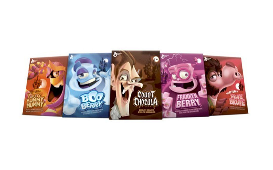
The Monster Cereals in Refreshed Packaging
In August 2013, all 5 monster cereals hit the shelves for the upcoming Halloween season. All 5 sported updated Halloween cereal packaging designs and were instantly hits. For the Fruit Brute (renamed as Frute Brute) and Fruity Yummy Mummy cereals, it was their first time being available for purchase in decades (more than 30 years and 20 years, respectively). Target hit the jackpot, selling limited edition retro versions of the monster cereals with their original Halloween cereal packaging.
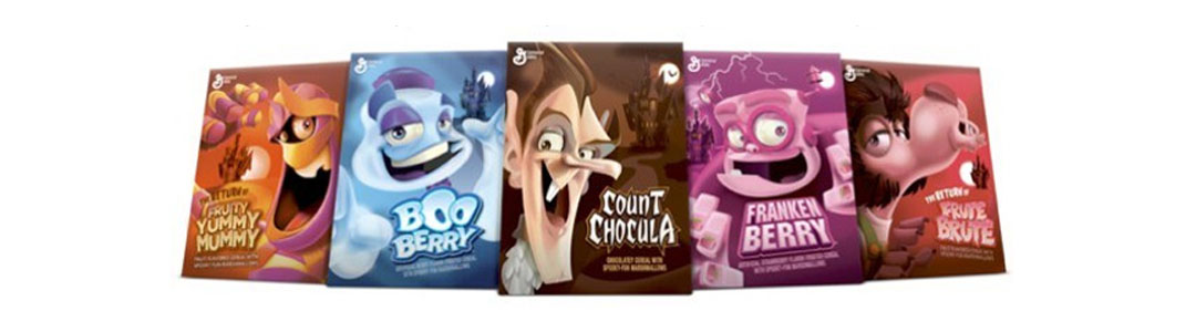
Which version’s your favourite? We love the way-back feel of the original boxes, but can’t deny the cool, eye-catching colours of the refreshed versions.
The Monster Cereals Card Game
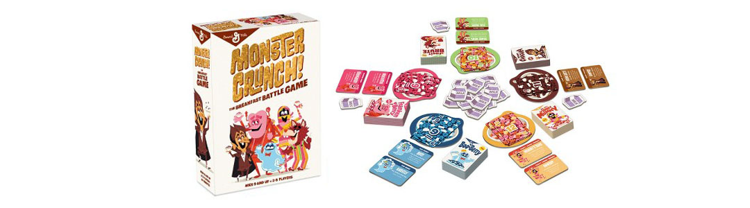
That’s right. They gave the fearsome fivesome a card game—and we couldn’t be giddier. Monster Crunch! The Breakfast Battle Game pits 2-5 players against each other, trying to see who can fit the most cereal cards into their cereal bowls (all flat cardboard, of course). What makes it so fantastic (besides being an interesting brand extension) is that the box, by sheer use of existing design elements, looks like Halloween cereal packaging. It’s deliciously eye-catching and our team can’t wait to play it. Deal us in!
The Kellogg’s Cereals
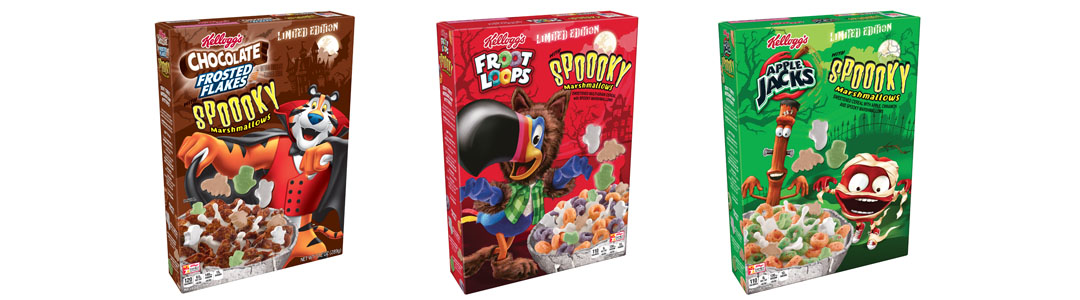
Tony, Sam, Apple and CinnaMon are keen to get in on the Halloween cereal packaging game, adding fun Halloween graphics to their boxes and getting decked out in Halloween costumes (though Apple and CinnaMon seem to have phoned it in, just a little bit). Adding spooky marshmallows and changing their cereal colours are a nice touch, and we just noticed those stone bowls they’re using—nice! It’s a fun, committed change to their standard packaging. We’ll keep a look out for it.
Halloween Crunch

The Cap’n Crunch cereals arguably represent the captain’s adventures on the high seas (His real name? Horatio Magellan Crunch). This time, it looks like he’s ended up on spooky island full of things that go bump in the night. Originally released in 2007, the Halloween cereal packaging tells a fun story—one of an island overrun by bats and (apparently) green ghosts. It proved so popular that Halloween Crunch is brought back in limited editions every few years. As a nice touch, the product’s name change shows a commitment to the fun of the Halloween season, and the colours suggest something may not be quite right with the captain. Best of all? Those green ghosts turn the milk green! The 8-year-old versions of us are totally game to see that.
Fun Fact: the 4 naval bars on his sleeves denote him as a captain, but over the years he’s worn 1 bar (commodore), 2 bars (lieutenant) or 3 bars (commander). Sounds like there’s an interesting story to his naval career!
What’s your favourite Halloween cereal packaging design? In fact, what’s your favourite cereal packaging design, Halloween or not? We’re huge fans of packaging here at The Packaging Company, and we’d love to hear what you think. Be sure to comment below, or find us on social media!