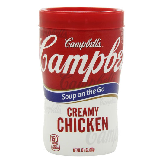
It takes a lot for something to reach iconic status, whether it’s a beer bottle, a chocolate bar or a pop star. It takes dedication, patience and uniqueness—properties not typically found in just anything. That’s why we’re such big fans of the Campbell’s soup can and it’s long, storied history in which it held onto its look and appeal without bending to fads, trends or industry critiques. That’s definitely what we’d call iconic packaging, and we’re glad to showcase it now.
Campbell’s was started in 1869 by Joseph A. Campbell, a fruit merchant who lived in Bridgeton, New Jersey. It started out by producing canned vegetables, jellies, soups, condiments and minced meats. But in 1897, John T. Dorrance, a chemist with degrees from MIT and Göttingen University, joined the company and developed a way to condense their soups. By halving the quantity of its heaviest ingredient—the water—he reduced the can size, and condensed soup took off.
Its blue and orange label was a mainstay for nearly 30 years, until a company executive by the name of Herberton Williams witnessed the Cornell University football team in action. Impressed by the carnelian red and bright white of their uniforms, he convinced the company to switch branding colours. And after winning the gold medal for excellence at the 1900 Paris Exhibition, they added the award to their iconic packaging label. The Campbell’s soup can was now fully formed.

The red-and-white label proved to be a smart choice, turning Campbell’s soup into a ubiquitous thing—known far and wide and everywhere. When people thought of soup, they thought of Campbell’s. When tv shows showed soup, they showed Campbell’s. And in the 1960s, when Andy Warhol began a new series of art, he used Campbell’s soup as his muse.

Creating 32 pieces covering the soups available at the time, they’ve become one of the most well-known and celebrated groups of art in world. In 2012, the series had its 50th anniversary, and Campbell’s released a line of cans paying homage to both their original can design, and the pieces that Warhol created. They were so popular, they were quickly difficult to find and have become valuable art all their own.

Since the inception of the red-and-white label, it hasn’t changed much at all, altering only the smallest of elements like language choices and graphic placements. In that time, Campbell’s has grown into a food titan with over 200 product lines to its name, including soup that can be brewed in Keurig machines, easy-to-carry containers called Soup on the Go, and an entire line of Halal products.

It’s only recently that Campbell’s has decided to alter their iconic label in a significant way. The newest iteration now turns the red top half into a waving banner of colour, while a shot of piping-hot soup adorns the white bottom half. While it’s certainly more contemporary, some people are decrying the change, saying it takes away from what Campbell’s truly is. We’ll leave it up to you to decide for yourself.

Commitment, colour and clarity are big hallmarks of the Campbell’s soup can. It’s kept its personality and branding consistent for over a century, and it doesn’t look like it’ll change any time soon (why mess with a good, smart thing?). As a proud addition to our iconic packaging collection, it’s one of our favourites (we have a lot those, we admit it!). Do you feel there’s any brand packaging out there worthy of the iconic packaging title? The Packaging Company would love to hear from you!
Sources: Pinterest, Perimeter, Campbell’s


