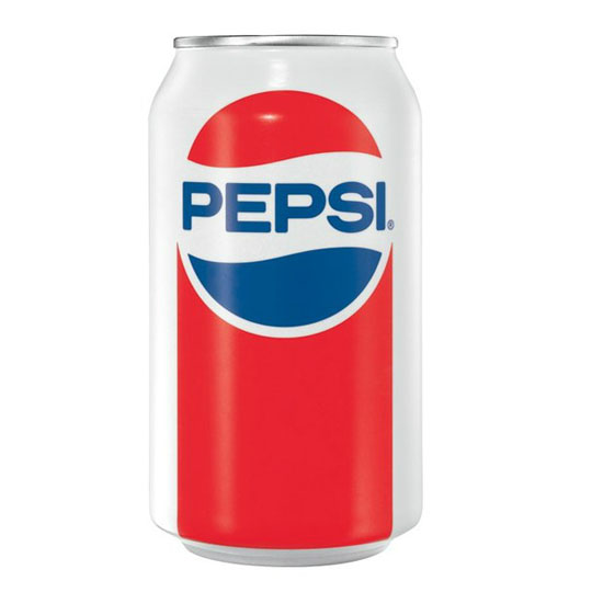
It’s exciting watching a product’s packaging change over the years. If handled right, it keeps what made past versions so successful, while adding something that makes it more noticeable and unique. Over time, these changes add up to a storied and interesting packaging history. And, in the case of some brands, that packaging history becomes worthy of the title of iconic packaging. We’ve showcased quite a few brands who we feel have iconic packaging, and we’re excited to add Pepsi to that list.
Pepsi, for all its iconic status, didn’t start out with that name. Launching in 1893, it was known as Brad’s Drink, created by Caleb Bradham and sold from his drugstore in New Bern, North Carolina. Made with sugar and vanilla, he wanted to create an appealing drink that would aid in digestion and boost energy. It wouldn’t be until 1898 that he renamed it to Pepsi-Cola, after the root word “dyspepsia” and the kola nuts used in his recipe.
Throughout the years, Pepsi has committed to packaging that both furthers themselves, while embracing other people’s lifestyles, hobbies and values. That’s been especially true lately, as they’ve created some seriously fun, interesting and diverse pop can designs. Let’s take a look!
Pepsi Throwback Cans
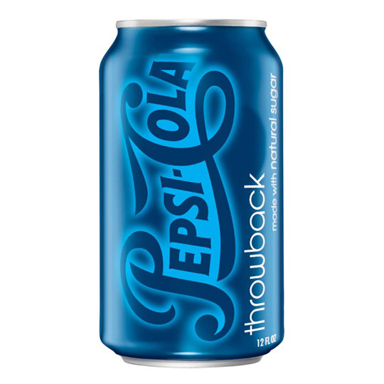
Released in 2009, it featured an old version of the Pepsi logo merged with the cool steel blue they use on their present-day packaging. The recipe itself features real sugar as its key sweetener, rather than high fructose corn syrup. Offered as a limited edition, it sold out quickly, with customers demanding it well after it left the shelves. Now they release it every year or so, in a can that more closely resembles the original white packaging. Demand still hasn’t abated.
King of Pop Cans
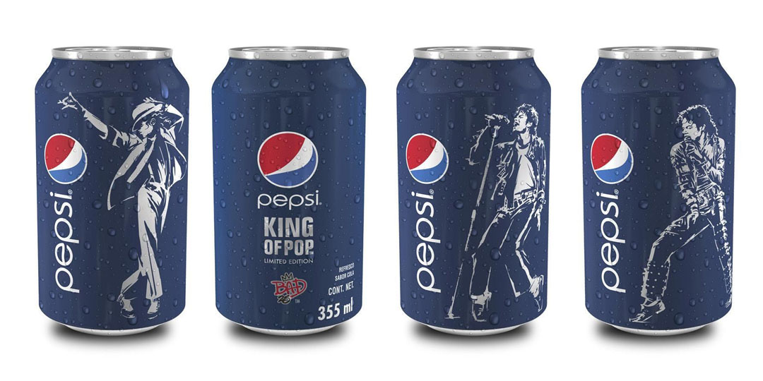
2012 marked the 25th anniversary of Michael Jackson’s album Bad. Along with a re-release of the record itself, Jackson teamed up with Pepsi to create a special line of cans called the King of Pop collection. Featuring white silhouettes of Michael in some of his most famous outfits and poses, they were a massive hit overseas and were notoriously difficult to find in North America.
#pepsiMoji Cans
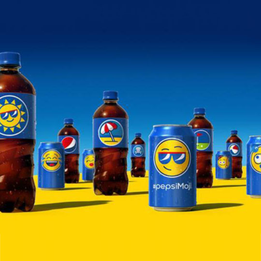
In 2016, Pepsi commissioned a set of stylized emoji for a new social campaign. Designed to enable easier communication, they were a big hit at concerts and outdoor events where it was difficult to converse with friends or other music fans. In Europe, they were particularly well received, helping overcome basic language barriers for tourists and fellow partygoers.
120th Anniversary Retro Can
To celebrate their 120th anniversary, Pepsi revived two of their biggest successes: the iconic white can they used for decades, and Cindy Crawford’s Superbowl ad. Turning her into a limited-edition emoji, the new ad used animated #pepsiMoji on the iconic cans to replay her original commercial. Unsurprisingly, it was another big hit for them.
Year of the Dog Cans
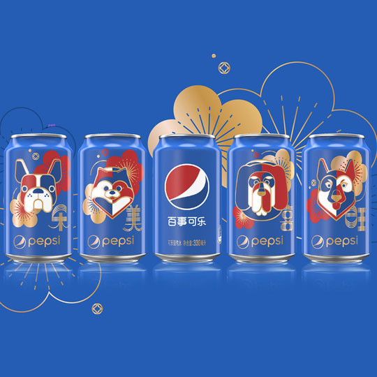
2018 marked the Year of the Dog for Chinese New Year. To commemorate the occasion, Pepsi released a line of gorgeous cans featuring stylized dog imagery. Showing a sense of humour and playfulness, Pepsi shipped the cans in dog house-shaped cases, rendering them a hugely sought-after collector’s item. Interestingly, the cases were only sold through e-commerce stores, an intentional choice made to reflect how peoples buying habits are changing.
Colour, respect and timeliness are a big part of Pepsi’s packaging choices. A brand that can confidently welcome artists and cultures onto its pop cans, like Pepsi does, is one to be respected and admired. That’s why we think they’re worthy of the iconic packaging title. Are there any brands you think are worthy, too? The Packaging Company would love to hear from you!